Industry: Music Platform: iOS Duration: 2 Weeks
Music Crave is an app that seeks to bring back the good ol’ days of receiving and making custom mixtapes with curated music. Most people discover new music through friends’ recommendations and playlists, but have a hard time keeping it all organized and easily sharing fresh tunes. Music Crave makes it easy and fun, all in a unified interface that allows you to share music within the app. This was an academic project where my role was to perform user research and testing, rapid prototyping and design.
The Problem
The music people are receiving from current music platforms is not relevant to their lives and they need it to stay motivated, energized and focused.
The Challenge
The opportunity here: How might we help people share and receive music recommendations through a experience that is more personalized and comprehensive than their current music platforms, in order to receive music that is more relevant to their lives and helps them feel more energized, motivated and focused?
Target Users
Busy + tech-savvy millennials (ages 18-34) who want to find music that is more relevant to their lives. Based on user research data: of 112 respondents, 81.2% were between the ages of 18-34.
Hypothesis
We believe that providing a music sharing recommendation tool for people who wish to find music that is more relevant to their lives will help them stay more energized, focused and motivated.
We will know we are right with an increase in adoption rate based on app analytics, a steady flow of repeat users (customer loyalty), and positive customer reviews.
We will know we are wrong if there is a drop-off in use, if users are not receiving/finding/sharing music they find relevant, low rate of repeat/continuous users, and a majority of negative customer reviews.
User Research
I had to understand who I was designing for and how exactly I could improve their lives, so the first step here was to complete user surveys and interviews. I received 112 user survey responses and completed 5 user interviews. Here are some of the key takeaways:
- Who is consuming music?
- 81.2% of respondents were between the ages of 18-34
- How are they consuming music?
- 47.3% of respondents consume music through paid streaming services
- and 64.3% of them consume music on mobile apps – mainly Spotify – 74.1%
- What are they listening to?
- Personal playlists (75.9% of respondents) built on friends’ recommendations (72.3%)
The following are some quotes pulled from the user research, helping me to further empathize with their frustrations and pain points:
“It gives me the mood I need for the moment.”
“Too many ads.”
“It brings out my creativity.”
“The algorithm doesn’t understand me, my tastes.”
“I haven’t been able to find enough of those WOW releases, ones I can love like they were my own child, or a lover.”
“I hate ads.”
“It gives me the opportunity to focus on the present moment.”
“Music feeds my soul.”
I was pleasantly surprised at just how involved people feel with music and the kind of role it plays in their lives. It became clear to me that the current music consumption services are not adequately helping users fulfill their goals and feel like they are getting the music they require.
Making Sense of It All: The Affinity Diagram
This has become one of my favorite tools in the UX/UI design process, and my go-to for making sense of the huge amounts of data pulled from user surveys and interviews. I started by writing down pieces of data that stuck out to me, especially when accompanied by a specific percentage of users. Then, I began organizing them into different groups: Music-Consumption Habits; how users find New Music; Music Streaming Services; Devices used; User Expectations; User Frustrations; The “Why” behind their habits; the “How” behind their habits; initial ideas for Features; and Brands/Influences.
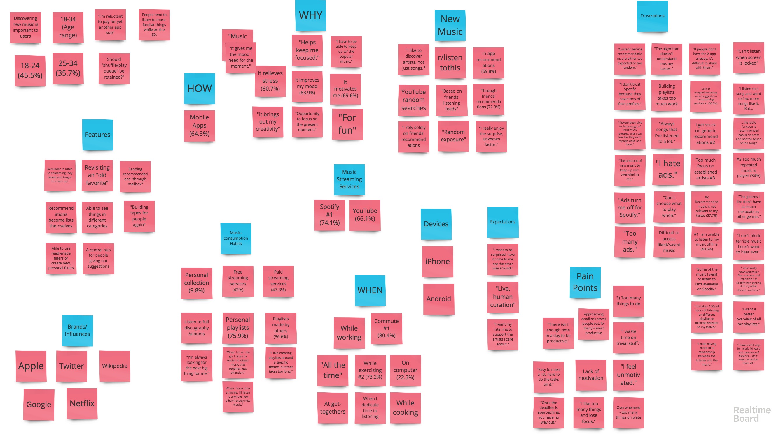 The Affinity Diagram proved to be a tremendously-helpful tool to empathize with the users even further, with their goals, motivations and pain points, as well as their wishes and habits, and what tools they already use. It just helps make everything clearer. With this, I began to brainstorm some initial focus areas for possible features to include in my project.
Competitive Analysis
Now that I had a better idea of who I was designing for, I had to figure out what was already out there in the market to identify any possible gaps for a unique experience provided by my project.
Some of the competitors analyzed
- What is working?
- “It’s pretty cool because when I’m in the middle of house work the songs I want to listen to just instantly come on! It’s magic!” (example taken from a Pandora customer review)
- “Since discovering Pandora listening I have found great joy in listening. Music is uplifting, I am able to choose genres that match my feelings and mood at certain times of the day or simply get me going, they energize me!” (example taken from a Pandora customer review)
- Customization option to get more diverse music or exclusive music
- What isn’t?
- Intrusive Ads/Lack of “contextual” ads: “When I’m listening to my piano music when I’m going to bed I hear ads come on and then my insomnia kicks in full force.” (Pandora)
- “I wish we could like/dislike songs on the lock screen without having to unlock the phone each time.” (YouTube Music)
- “Listening to one artist I get other songs by artists that I hate.” (YouTube Music)
- Not being able to listen offline
- Interrupting playlists to play random song (Spotify)
- Forced sign up on first use of app: “Don’t make me sign up first thing without even knowing if I want to use it” (Pandora)
- None of these apps allow you to share music within the app. They all open up a popup that lets you share it externally through WhatsApp, text, email, or Instagram Story (Spotify): Focus on letting user share music with friends within the app itself
- Pandora doesn’t let you see what’s it’s recommending next
- Pandora – recommended songs that you want to delete from Recently Played but can’t
- Spotify Daily Mix seems to work well for many users, but only after a lot of use and hours put into it = WORK
- Big Takeaway: Focus on music sharing, playlist creation focused on friends’ recommendation. Spotify algorithmic-recommendation seems to work really well for some people (after they “put in the work”) and not so much for others. But discovering new music through friends recommendation is the majority, so that should be a focus for my own app.
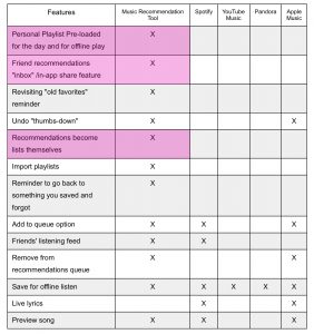
I filtered this information into a Feature Comparison Chart (seen below) so I could identify the key features that are missed in the marketplace, based on user frustrations and goals: Sharing with friends within the app, without exporting to external messaging apps; a Personal Playlist pre-loaded for the day and for offline play; and Recommendation from friends become lists themselves.
User Personas
At this point I had a pretty good grasp on who my users were, what they needed, and what the market wasn’t delivering. But I needed to connect some more dots, namely, how my MVP could serve my users’ particular needs throughout their day. I decided to generate Primary and Secondary User Personas to put a face to my users and humanize them.
I thought about the younger users, students, busy all the time, always stuck on commutes (train, subway, bus, car, walking) and using music to keep them energized and motivated. They use it to focus during more “physical” tasks and less during tasks that require more mental focus. But music “gives them the mood they need for the day”. The secondary persona is a bit older, maybe married and with kids, has an established career. Uses music to stay focused while exercising, and also with the creativity in work and hobbies. Meet Busy Bryan and Bored Becky:

Busy Bryan (Primary Persona) 22, Busy student, tech-savvy
and Bored Becky (Secondary Persona) 31, Millennial Mom, Active
And to flesh out my primary persona, Busy Bryan, a bit more, I created a more complete User Persona diagram (seen below). The “narrative” and “character development” of the User Personas is based on trends and key takeaways from user research, taking into account the demographics, goals, frustrations, use of technology, etc., of the users.

This tool would prove to be invaluable throughout the entire process, as I would repeatedly ask myself “would Busy Bryan actually benefit from this? Would this help him achieve his goals?” or “What would Busy Bryan expect to see here?”, among other questions. So it was tremendously helpful to have a more human representation to refer back to and to help inform decisions.
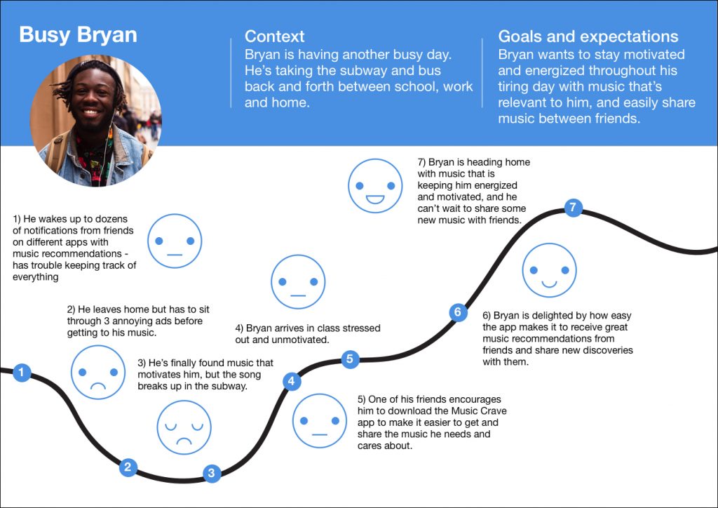
The User Persona tool helped me understand the users’ goals on a slightly more micro-level, but to go even deeper I created a User Journey for Busy Bryan (seen below). This is a typical day in the persona’s shoes, pinpointing specific pain points throughout the day, their emotional state, and how having the new tool developed in the project impacts their lives and improves their emotional state. I also found this useful to identify opportunities to captivate the users’ attention depending on their mood and, once again, help them achieve their goals. Guess it’s also the character designer/storyboarder in me. It’s exciting.
Concept Sketching
Now it was time to get sketching! I needed to start visualizing what my main features could actually look like and what form the layout would take. Since the majority of users relied on mobile apps for their music consumption, I decided to focus on mobile app designs for my concept sketching.
I completed a couple of rounds of Crazy 8s – 8 different concepts/ideas in 8 minutes. It is a great exercise to get the creative juices flowing and take risks, go crazy, without worrying too much about the details. With three different sets of layout ideas/flow ideas in hand, I tested them out with users. Here is some of the feedback (seen below) I received:
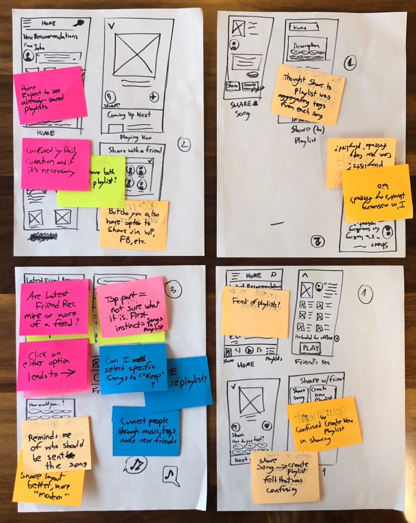
- Option 1
- User missed option to shuffle in addition to play on playlist preview screen
- User thought “create new playlist” button would be more natural as a “add playlist” button, and having the option to create a new playlist within that page
- Missing step to choose friends after clicking on Share
- Missing a title like “Add Comment” on Share Song page, user thought it was a friend’s status
- Thought the home screen would have a “feed of playlists”
- One user felt the flow from Share Song to Create Playlist was confusing
- Option 2
- User expected Home Screen to have “feed” with friends’ “requests” (“I need some upbeat music to get me motivated!”) so you can know which songs you can recommend to “fulfill their requests”
- On Home – expect to see already-saved playlists
- “But do you also have the option to share via WP, FB, etc.?”
- “Can you download playlists? Can you copy friends’ playlists?
- On initial share screen, user expected “Send” option. And thought they were selecting multiple friends to send to at once
- Option 3
- “This is cool – it’s like connecting people through music, tags, making new friends.”
- On Home Screen – “Are latest Friend Recommendations mine or more of a feed?”
- On Home Screen – “Can I scroll through friends’ recommendations, swipe left?”
- When viewing a friend’s recommendation playlist – “Can I select specific songs to “keep”?
- Is the sharing option for sharing the entire playlist?
- User thought that pressing Share button would allow them to see friends’ latest statuses, allow them to choose appropriate friends (those who would “benefit” from the song recommendation specifically) to share song/playlist with
- For Share Screen – one user thought it was cool that it reminded you/helped you find the friends who should be sent the song/playlist in question.
- For Share Screen – “I like this Share layout better, it’s more modern.”
It was fascinating to see how each user’s unique mental model (based on their experience with other apps, products and their own goals) influenced the layout and functionality they expected to see in my own app. Whereas certain terminology or buttons were super clear to their users and matched what I intended, other parts of the flow were confusing and unnatural. Certain wordings I chose had different interpretations depending on the user – a humbling moment that reminded me that I had to keep the user in mind at all times and not make decisions that I assumed would be universally understood. This was also a crucial part of testing in that it helped me discover how to organize the information, at least initially, based on users’ expectations.
Card Sorting
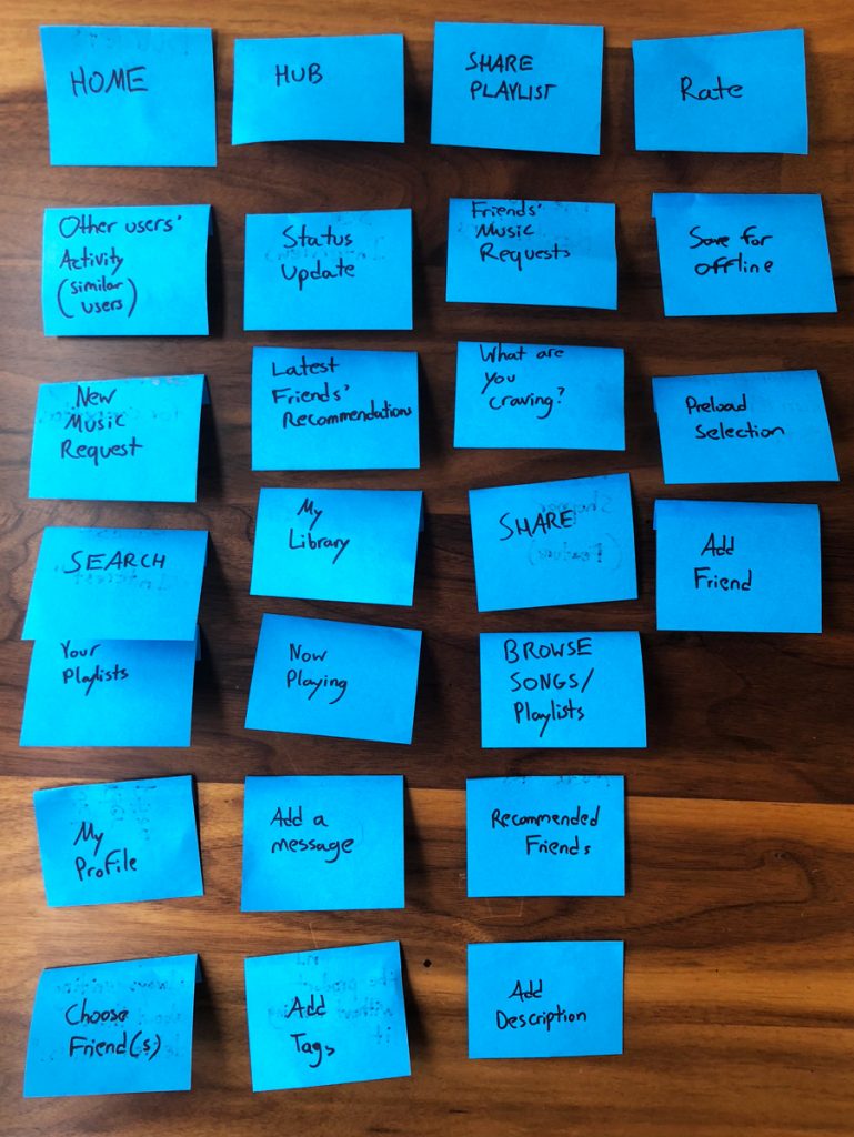
Now I needed to pick the best parts of each layout option, based on the feedback from concept sketch testing, and turn that into paper prototype V1. Before I could that, however, I felt the need to do a first run-through of the User Flow to help me visualize step-by-step what the user would have to do to get through the ideal path through the app, the Happy Path. The first version of the User Flow definitely helped inform the Site Map version 1.0, but in order to refine my information architecture I went into some Card Sorting. This is another one of my favorite tools, like the Affinity Diagram. It is very practical but shines a enlightening, well, light on different users’ mental models and how they expect information to be organized. I started out by writing down different parts, buttons, sections and functionalities to be included in the app, according to my feature prioritization, in no particular order or grouping:
Next I had a couple of users perform the Card Sorting, grouping cards as they saw fit, and adding or removing cards if necessary.
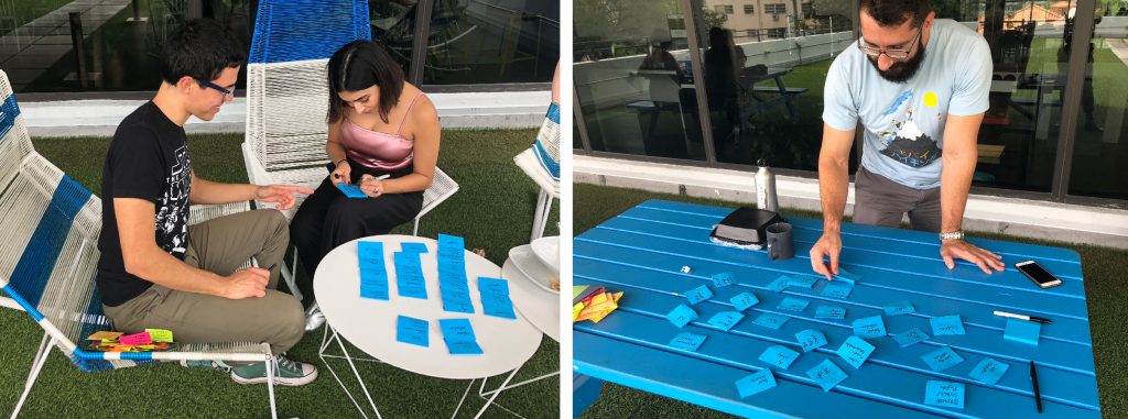
Card Sorting with different users
Here are some of the key takeaways:
- One user felt Home and Hub were kinda interchangeable. Understood it to be the “central” place of the app.
- One user suggested bringing in some music terminology into play to make it more fun (something that had come up earlier). One initial idea I thought of at the moment was using “Mixtapes” instead of “Playlists”
- Users missed a place to look for all their friends, where they could see all the friends they had on the app.
- One user found “what are you craving?” and “search” a bit interchangeable.
- Users were confused by “Preload selection” – would have to find a better way to phrase and explain that it was a “save for offline”-type option.
- Under playlists – “I’d like to see individual songs and move them around”
- “Is ‘Now Playing’ what friends are playing, or what’s trending, or what I’m listening to?”
- Users would add the “Share” option to playlists as well
- “Status update – what mood you’re in, what genre you’re listening to.”
- “Hub – latest releases, artist activity?”
A great “a-ha” moment from the Card Sorting was that the IA became more clearly organized into three core areas: Sharing – the sharing of music, focus on interaction with friends; Searching – the searching of music, focus on finding new music; Library – the archiving of music, focus on personal playlist, collection, also made by choosing from recommendations (with a fourth “subsection” – the listening of music, Now Playing section, with option to add to playlist(s) as well. I used all this feedback from the Card Sorting to refine my Site Map.
Lo-fi Prototype
With the structure of my app clearer, I sketched out the screens to put together the lo-fi paper prototype, adding hotspots in InVision to make it interactive.
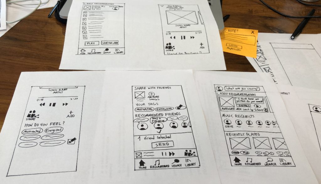
Lo-fi Prototype screen sketches
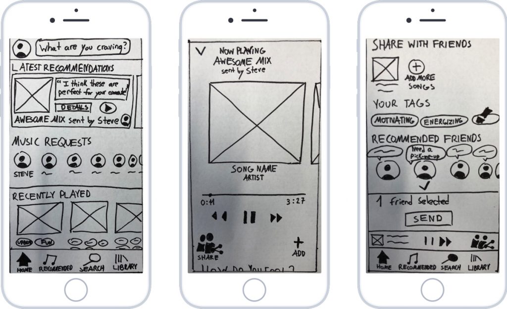
Lo-fi Prototype Home, Now Playing and Share screens
Some of the main takeaways from testing:
- I had to make certain terms/titles more clear (Rec. Friends, especially Music Requests), either by changing them or including sub-headers to explain in a bit more detail.
- Had to make progressive disclosure clearer. Users know there’s more, hidden content. Some users got it, others didn’t see it immediately.
- Make overall layout less overwhelming, neater.
- “Recommended Friends – friends with similar tastes?” – this was a tricky thing to display because it was a group of friends the app would recommend to share the selected song(s) with based on what they’re craving and how the user described the selection.
- Users wanted to see tags added by friends and by themselves.
- Users felt the “What are you craving?” section would be more natural in the profile section
- Users wanted to see more “thematic” elements into presentation
This part of testing also helped validate part of my concept; users loved focus on sharing music with friends, the friend aspect, having friends’ names clearly on there. They found that getting a personalized playlist is fun and interesting. But they wanted to see more of the “friend/social aspect” presence throughout the entire app, the nav bar, etc.
Mid-fi Prototypes
It was clear to me that the main flow of the app was clear to users and had them intrigued. But they craved a deeper level of interaction and I took all their feedback into account to create the Mid-fi prototype. I reproduced the refined layouts in Sketch and added hotspots in InVision to make the main flow interactive. I added some more personality and thematic elements to make the experience more fun, according to user feedback; playlists became “Mixtapes” and the icons changed to match the music-centered theme. In addition, I added the sub-headers to explain the section titles more clearly.
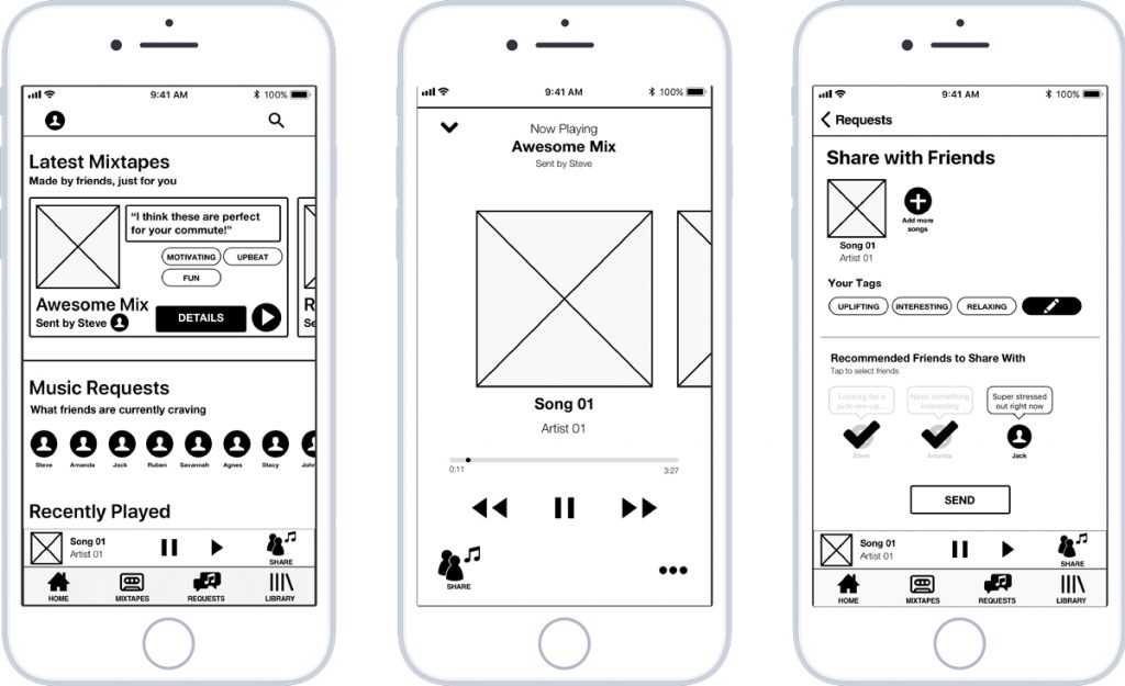
Mid-fi Prototype Version 01 Home, Now Playing and Share screens
Here are some of the main takeaways from the mid-fi testing:
- When clicking on album art on Now Playing, users expected to see details on artist (short bio, year, recent releases, genre, most frequent tags)
- Users did not expect to see a list of “what’s coming next” by scrolling down on the Now Playing Screen. I would have to figure out a better way to indicate that.
- Users wanted to scroll through tag options and choose the appropriate ones.
- Some users wanted a secondary option to be able to share music with friends outside of the app. I would have to include that, but keep it secondary as the app’s distinguishing feature is to allow for sharing within one cohesive platform.
- Users expected to see several different options on the Options button on the Now Playing screen; options like share, add, comment, tag options, and finally external share.
- Users wanted to go back to the previous pages, but I didn’t always include a way to go back. This was a wake-up call for me, to always include a way for users to go back a page, undo, revert, etc.
- I also had to make it clearer where they are within the app, within the navigation, as it was a bit confusing in the first version of the mid-fi prototype.
With this in mind, I made some refinements and also improved alignment and layout based on guides and the 12-column rule, improving legibility and flow of the layout. In order to push the users towards the hidden “Coming Up Next” section of the Now Playing Screen, I added a button called “Up Next” which would automatically scroll down to the list of upcoming music on tap. Users also wanted the option to rearrange the song order, even in a playlist put together my a friend, so I added the appropriate re-order symbol. On the Share screen, I added an option for the user to choose another friend, in the event that the app had not recommended the friend they had in mind, as well as the secondary option of inviting friends outside the app.
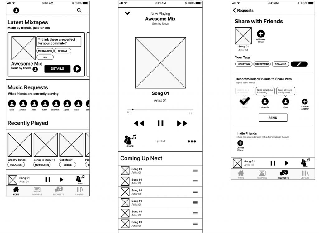
Mid-fi Prototype Version 02 Home, Now Playing and Share screens
The flow made sense to the users and they could easily and quickly accomplish the tasks along the Happy Path – browse the most recent mixtapes sent by friends, choose and play the most recent, and share it with other friends. The most important bit of feedback I received was that users felt a bit overwhelmed with the amount of content present on the home screen at once, especially the number of friends on the Music Requests card.
Brand Attributes + Moodboard
I was satisfied with the current state of the main user flow and decided to begin research to create the User Interface. The moodboard is a valuable and essential tool for beginning this process; it helped me get into the feel, mindset and the, well, mood of the theme behind the user interface. First I brainstormed a list of brand attributes which described the feelings the app should elicit from the user: Inspiring; Entertaining; Intuitive; Flexible; Accessible; Helpful; Modern; Fun; Fast; Friendly; Exciting; Cool; Smooth; Nostalgic
And refined that to the core brand attributes:
- Friendly
- Energetic
- Modern
- Fun
Before collecting images to start the moodboard in earnest, I completed a Visual Competitive Analysis to understand both the current trends in music app design and universal symbols and elements. There are various parts of the interface that have to remain consistent across apps because their meaning is so ingrained in users’ mental models and it facilitates the on-boarding process and makes an app more accessible.
Some of the main conclusions I drew were the use of multiple palettes and gradients in one (as in Spotify), heavy use of gradients (in both Spotify and Pandora), and use of white, clean and minimalist design with color accents (Apple Music).
At this point I felt ready to pull together different images to create my moodboard. This is a reduced version of it:
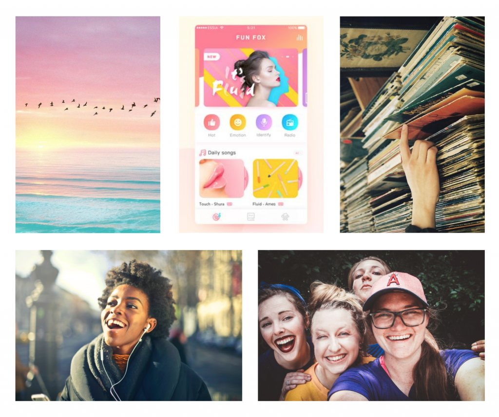
Besides collecting references for the actual “feel” the app should have, I also searched for representations of the context-of-use for the app, natural gradients which would influence the color palette, as well as examples of compatible UIs for inspiration. I had a couple of users take a look at my moodboard and describe it in their own words, and I was happy to see that their interpretations were right in line with the brand attributes that had guided its creation in the first place.
But I found it incredibly difficult to hone in on a set of colors for the app; finding a balance and not using too many colors was complex, all the while keeping it friendly, energetic, modern and fun. I figured some A/B Testing was in order, so I created the first set of screens for the hi-fi prototype.
Hi-Fidelity Prototype Version 01
With the finished mid-fi prototype with the full basic flow and screen states, I focused on creating hi-fi versions of three main screens – the Home screen, Now Playing screen, and Share screen.
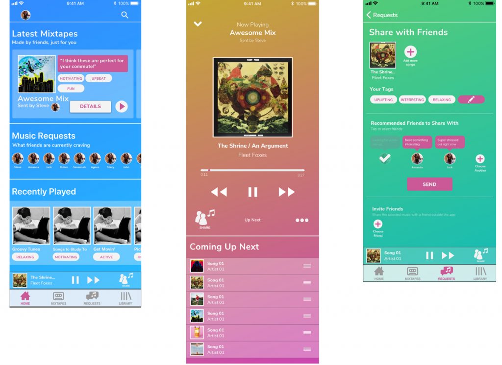
Hi-fi Prototype Version 01 Home, Now Playing and Share screens
The feedback I received from these screens was crucial. Not knowing which sets of colors to choose, this is where the A/B testing came into play. Users really enjoyed the pink-yellow gradient feel, wanted to see it more in the blue gradient, but felt that green gradient was out-of-place. They enjoyed the combination of the blue background with pink-colored elements.
Users described the colors as “Groovy – makes me think of live music!”, “made me feel relaxed, not at all frustrated”, as well as “cool”, “friendly”, “energetic” and “modern”, once again in line with my brand attributes. I was happy to see that the colors resonated with users in a positive way. The flow was also revalidated – “It’s all very clear, I knew where to go and where I was. The steps were very clear.”
Style Guide
I had a better idea of how to design the user interface, so it was time to tie it all together and choose typefaces, refine button sizes and styles, and choose a name for the app and create a logo.
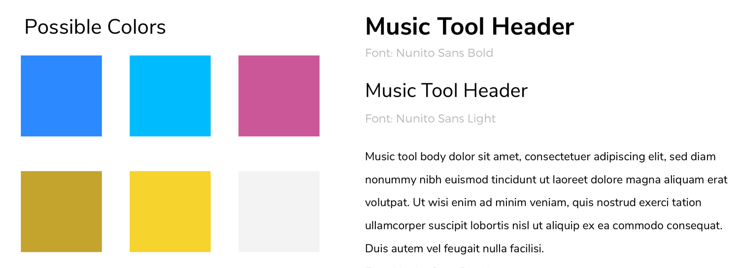
I chose a script-style typeface to evoke the friendly, hand-made feel of the app, as if a friend had written it by hand for you. I modified a mixtape icon from The Noun Project (full credits at the end of the case study) to be used for the logo and typeface variations of the logo. The name itself came after a couple of brainstorming sessions. I wanted to find a way to summarize the goal of the users when coming to the app – a home for the music that is truly relevant to their lives.
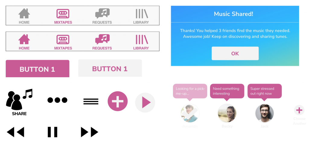
Some of the boxes, buttons, icons and glyphs used to build the screens and nav bars.
Hi-Fidelity Prototype Version 04
After a couple of tests, I was able to refine my hi-fi prototype further and improve legibility to give the entire layout more breathing room and not overwhelm the user with too much content at one time, make the design and navigation more consistent throughout screens, incorporate the new branding. I also finished adding hotspots to all the buttons and parts of the navigation.
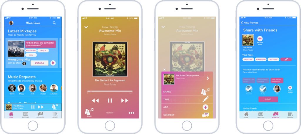
Hi-fi Prototype Version 04 Home, Now Playing, Now Playing Options Overlay and Share screens
With the positive feedback received from this version, it was time to add animations and transitions to give the users better feedback for their actions, as well as to add another degree of fun to the experience, and delight users.
I sketched out some simple storyboards for how the different cards could enter the screen, how overlays would come in and leave, and how buttons would react to a user’s tap or hold. I took those ideas into Flinto to make them a reality.
Access the latest prototype of Music Craze here.
Unfortunately, since the microinteractions were created in Flinto, this version only has the basic screen transitions and no sideways scrolling. The entire user flow is intact, however. The following video shows the entire happy path with the microinteractions included:
Conclusion
There’s much work to be done to refine my project, but I am satisfied with where it’s at. The biggest lessons I’ve taken away from this project are and would like to share are:
- Trust the process. Every step is important, no matter how overwhelming it might seem at the moment, or even “unnecessary”. The results will speak for themselves
- Every decision that is made, is made because of user testing. No exceptions. User feedback informs every direction to take, refinements to make, etc. And testing the whole way through just makes our lives a lot easier because we know how to proceed and are not left wondering and trying to make things up.
- Number one rule, and one I’ve picked up from various UX/UI design case studies and from teachers: You are not your user! I repeat, you are NOT your user. I experienced this myself; it is hard to really, truly set aside your ego entirely, to stop trying to make things according to your tastes or what you would like. It is crucial to relate back to the research, to the data, and to empathize with the users’ goals throughout the entire process, in addition to validating every iteration with them to know how to proceed.
It was fun working with a theme so near and dear to my heart, but it gave me a entirely new perspective. I could see how different people consume music and what sort of role it plays in their own lives. I was also surprised to see how pervasive mobile-app streaming is, I expected it to be a bit more split evenly with the recent resurgence in physical sales. But, in closing, I would like to do some further testing to iterate on my current prototype and improve the user interface.
Credits and Acknowledgements
Stock Image authors: Bruce Mars, Hannah Nelson and Yingchou Chan from Pexels.com
Icon authors: mikicon, lastspark, flamingo, Annette Spithoven, and Mooms from The Noun Project
I would also like to thank everyone at Ironhack Miami and Building.co for their invaluable help throughout this project. A special thanks to my class: my instructor David Fast, my TA Snezana Dragusev, and my classmates Hugo Ramos, Hector Gutierrez, Nicole Rodriguez, Monica Gragg, and Frantzie Bazile. And to you, for following me along on my journey! I hope you found this case study useful. Feel free to contact me with any thoughts, suggestions, feedback, or proposals! Let’s start a discussion! 🙂
-Matt


