Industry: Wellness (Time Management) Client: The National Wellness Institute Platform: iOS Duration: 2 Weeks
The main goal with the Set Out app is to improve the user’s wellness by helping them to make better use of their time. It helps them prioritize tasks and focus on the most important goals and tasks at the moment, avoiding a overwhelming scope of things to do and to get done. Users also get detailed and fun statistics-tracking and achievements to get a clear sense of their progression, and can exchange all that information with a wellness coach who can better guide them towards their goals. This was an academic project where my role was to perform user research and testing, rapid prototyping and design.
Brief
The client, The National Wellness Institute, has experienced a substantial drop in membership because their members are abandoning them and embracing wearables and activity-tracking technologies, and the NWI has been slow to catch up with technology. They need to find a way to add value to their members.
The goal is to come up with a new tool that users can use to improve their wellness with the guidance of a wellness coach by helping them improve their time management and make the best use of their time
The Problem
The Wellness Tool for time management needs to add value for NWI members because they are losing members to mHealth apps and other activity-tracking products.
The Challenge
How might we improve time management and productivity routines and habits so that our customers are more successful?
How might we help users prioritize tasks so that they do not feel overwhelmed and can actually get work done?
How might we help users turn off/reduce distractions, especially social media, long enough to become more productive?
Target Users
Our target users are busy individuals between the ages of 18-34 who are tech-savvy and looking to improve their time management and make better use of their time. Based on user research data: of 117 respondents, 69.2% were between the ages of 18-34.
Hypothesis
We believe that providing a time management and productivity tool for people who wish to improve their time management and make better use of their time will help them achieve their goals and become masters of their time and improve their wellness.
We will know we are right with an increase in user productivity based on app analytics, if customers are able to follow through on their goals, an increase in adoption rate and NWI membership, a steady flow of repeat users (customer loyalty), and positive customer reviews.
We will know we are wrong if there is no increase in user productivity through the use of the Wellness Tool, if there continues to be a decrease in NWI membership, if there is a drop-off in user adoption, low rate of repeat/continuous users, and a majority of negative customer reviews.
We also need to make sure that customers can clearly see their progress and understand and define their goals and priorities, and that they understand the benefits of proper time management and the results that brings.
User Research
I had a better understanding of my users’ problem, but before I getting to any sketching or brainstorming, or even thinking of possible solutions, I had to understand who the users were exactly and how I could help them achieve their goals. Enter the User Research. I received 117 user survey responses and completed 6 user interviews. Here are some of the key takeaways:
Do people feel like they need to make better use of their time?
-
- 88% of respondents said that they feel like they should make better use of their time
I also asked them to explain a bit more about why they feel that way. Their answers gave me greater insight into their motivations and frustrations with their current habits:
“I want to meet my goals. I can’t manage time.”
“I want to accomplish greater things!”
“Easy to make a list, harder to do the things on it.”
“I feel like there’s more I can get done.”
“Exams in less than 2 months and I barely get any studying done.”
“I end up not doing anything that isn’t related to school or work.”
“I spend too much time distracted and unfocused.”
- What is impacting their ability to make the best use of their time?
- 71.8% said social media
- 68.4% said lack of motivation
- and 58.1.% said it was too many things to do or overcommitting
- What “productivity hacks” or “techniques”are people currently using?
- To-Do List (70.1% of respondents)
- Agenda/Planner (42.7.% of respondents)
- Pomodoro Technique (8.5% of respondents)
- When do people feel the need to make better use of their time?
- At home (26.8.% of respondents)
- With schoolwork (26.8.% of respondents)
- At work (21.6.% of respondents)
- With personal projects (3.4.% of respondents)
- What type of goals (short-term, mid-term, or long-term) are people setting for themselves?
- The majority (72.6% of respondents) said they set short-term goals
- What kind of goals do people prioritize?
- Career-related goals (49.4% of respondents)
- Money (13% of respondents)
- Family (11.7% of respondents)
- Hobbies (9.7.% of respondents)
- When do people feel like they are making the best use of their time?
- When their priorities are clear (41.% of respondents)
- With schoolwork (26.8.% of respondents)
- At work (21.6.% of respondents)
- With personal projects (3.4.% of respondents)
The data gathered here was essential in my understanding and empathizing with the frustrations, pain points, motivations, and wishes of users. I was surprised at how little time people devote to their personal projects (or, as some users described it, their “Me time”). It became clear to me that there is a clear longing for better time management among most users and most people are not satisfied with their current habits.
In hindsight, I should have developed some of my questions a little better, because a lot of them were open to interpretation. For instance, when I asked what kind of goals people prioritize, I included options for both career, money and family, and later I learned just how much those can overlap for certain users; career and money might mean the same thing for some, family and money might go hand-in-hand, etc. But it was certainly an important lesson for me.
I also decided to get in touch with a SME (Subject-Matter Expert) to help clear some of my doubts and validate my data. I reached out to Jake Knapp, author of the Sprint book and design partner at Google Ventures, on Twitter asking if he would be willing to answer some of my questions, thinking it was a long shot. Jake’s insight would be a tremendously-helpful contribution to my research as he is an expert in the field and has written multiple books and articles on time management and optimization, planning strategies and task prioritization, all areas I was tackling with my project.
To my surprise and delight, he responded and said he’d be happy to take a look. I sent him some questions via email and was excited to receive some great nuggets of information to digest. The main takeaway from his responses was that I kept using the word “productivity” in my questions and in my entire research, and his comment was a game-changer:
“I really don’t like the word “productivity” because I believe it encourages us all to act like machines in factories, reacting faster and faster, rather than human beings. […] So I’ve put “make good use of time” instead of “productivity” for your questions.”
Jake Knapp, author of the Sprint method
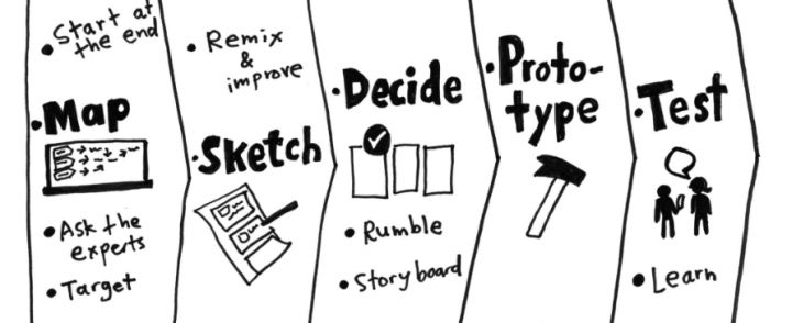
The Sprint Method
It changed my entire point-of-view on the subject and I immediately began to adjust my approach to the project and to time management, as well as eschewing the use of the word “productivity”. Throughout the entire process I would refer back to Jake’s feedback and it was certainly a turning point for this project.
Making Sense of It All: The Affinity Diagram
Once I’ve gathered plenty of data from user surveys and interviews, I love making sense of it all using what has become one of my favorite tools in the UX/UI design process, the Affinity Diagram.
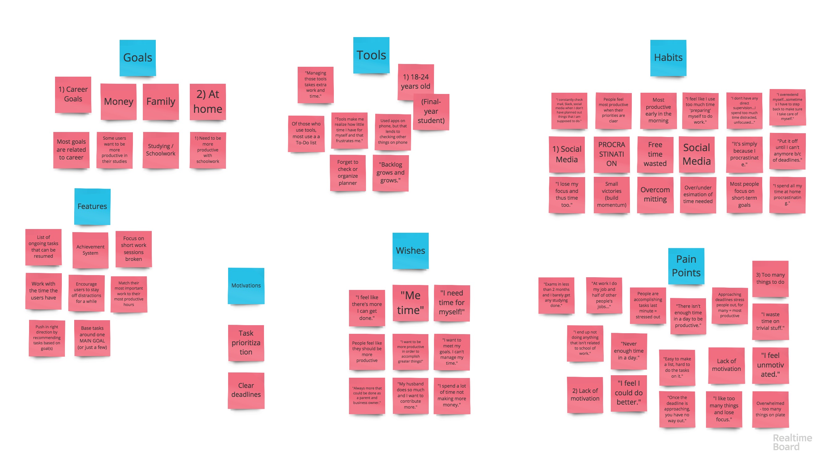
The first step was to write down every piece of data on sticky-notes, in no particular order or grouping. Once I had them all laid out before me, I began organizing them into different groups: Goals, Motivations, Habits, Wishes, Pain Points, Tools, and (initial ideas for) Features. This is how I would begin to truly empathize with users and understand what they were in need of and how I could design for them.
Competitive Analysis
I needed to learn more about the market and what competitors are already offering to find the gap my project could fill to truly help users. I began researching time management and productivity apps, downloading several of them onto my phone and computer. I started to get a feel for what works and doesn’t, and what users complain about in reviews.
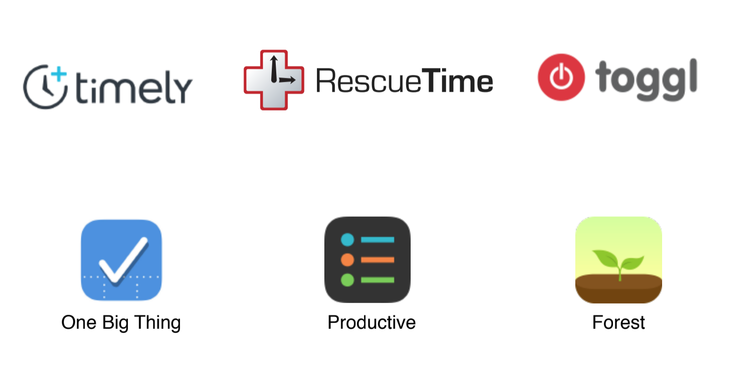
Some of the competitors analyzed
- What is working?
- Quick onboarding/intro slideshow (example: Toggl)
- Asking users goals/MAIN GOAL from the get-go (Timely – to log more billable hours to increase the user’s/the user’s team’s profitability or to find out how the user/his team spends their time to increase productivity, or option to enter a different goal)
- Just “Jump into the app” (Toggl, One Big Thing)
- Organize tasks by project and search them by tags, and show charts showing pie charts showing how much of the time you dedicated to different projects. (Toggl)
- Having the app work/sync across platforms (Toggl – Android, iOS and Desktop)
- Being able to pull up a list of ongoing tasks and “continue playing” them – return to them and continue working (Toggl)
- Having a clear list of what was worked on during the day (Toggl
- Letting users understand their daily habits/time management (RescueTime
- Letting users be as specific or vague as they want about tasks (Toggl)
- Help push users in the right direction when adding tasks/categorizing them (Productive lets users write their own tasks or choose from Health, Fitness, Home, Hobbies, Social, Efficiency, and has suggestions within each of those categories
- Adding visual stimulation/analogy for completing tasks (Forest)
- Forest uses a “tree-planting” analogy based on the Pomodoro technique. Users start a task by planting a tree, and as long as they stay in the app, the tree grows. If they leave the app, the tree begins to wither and die. The longer they work and the more trees they plant, the “lusher their forest becomes”. “I get a lot of satisfaction from seeing my daily forest grow.” They can plant different kinds of things based on how long of a task it asks for (ex.: a 10-minute Mushroom).
- Collaborating with friends (Forest – planting trees with friends)
- Certain gamification features. Forest – new tree species are unlocked, for every tree planted the user gains in-app currency, which they can use to buy real-life trees that will be planted (not really sure who actually pays for that…), Achievements to boost motivation (healthy tree/complete task streak, time spent focused…)
- Encouraging users to stay on task for short spurts and with regular breaks, “resetting their brains” to be able to focus for set periods of time (Forest – Pomodoro technique)
- Speaking a familiar language to the user that makes it more dynamic and fun (Timely uses emojis)
- One Big Thing: simple interface. Not overwhelming at all. Clean. Focus on the big stuff, with minor tasks. Nice motivation messages pop up when you finish a task. Easy to carry over tasks that weren’t completed the previous day.
- What isn’t?
- Timely – having users have to install a secondary app to track your activity on the web, and what apps you use. And although they guarantee it’ll be kept private and secure, it is a huge turn-away.
- Overwhelming amount of options/buttons, feeling completely lost. Personal Take: using the free trial of Timely and feeling overwhelming by the interface.
- I think having an active timer with an onscreen timer is a little too much. Might make users feel a little anxious and pressured. Better route might be to set short timers (like 25 min) and just notify them when it’s run out. (Toogl, Timely)
- Offering no in-app feedback on tasks, accomplishments, stats. Personal Take: used the Toggl app and felt a bit “abandoned”. It just let me add tasks and time how long they took me and it would show me the total time I worked during that week.
- Making it difficult to set and adjust start and end times/dates for tasks (Toggl)
- Forcing you to sign up (or logging on) before being able to browse the app and get a feel for it. (Toggl, Productivity Daily Planner) Personal take: using the Toggl app, it forced me to Log In or sign up for free before being able to continue. And I don’t even know if it’s something that I would actually find interesting, so why would I give them my email straight off the bat.
- Real-time timer feature for entering tasks, tracking time dedicated to them, and then having the user manually input the end time (to say the task is done/completed). In Toggl’s case, a lot of users forget to go back to the app and “finish” tasks, so they try to adjust the end time and it’s really a burden (poorly-designed slider)
- Very confusing edit options (especially for start and end times) (Toggl’s dreadful slider)
- Little-to-no coaching or guidance for users on how to be more productive. (Toggl, for instance). Users don’t know how to be productive themselves, so they need that guidance.
- Not sure if this is working or not (maybe there might just be a better solution?): blocking out certain sites and apps for a time defined by the user (the time they set to focus on a task). RescueTime does this. But it also notifies them when they spend a certain amount of time on a task. So something like that might be better than taking “control” from them and forcing them to do something. The goal is to teach them good habits and let them understand their own habits and how to improve.
- Daily Highlights (RescueTime) – but could use more focus on accomplishments, improvement
- Locking users out of using their phone or certain apps when sometimes certain apps contribute to their workflow, like students who converse over messages to work on an assignment together. (Forest, RescueTime)
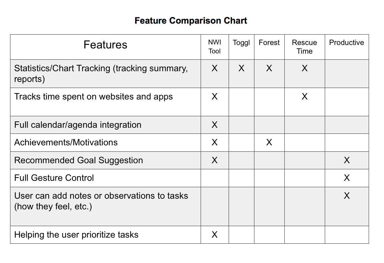
It was a lot of information to unpack, so I organized into a Feature Comparison Chart (seen below) so I could identify the key features that are missed in the marketplace, based on user frustrations and goals.
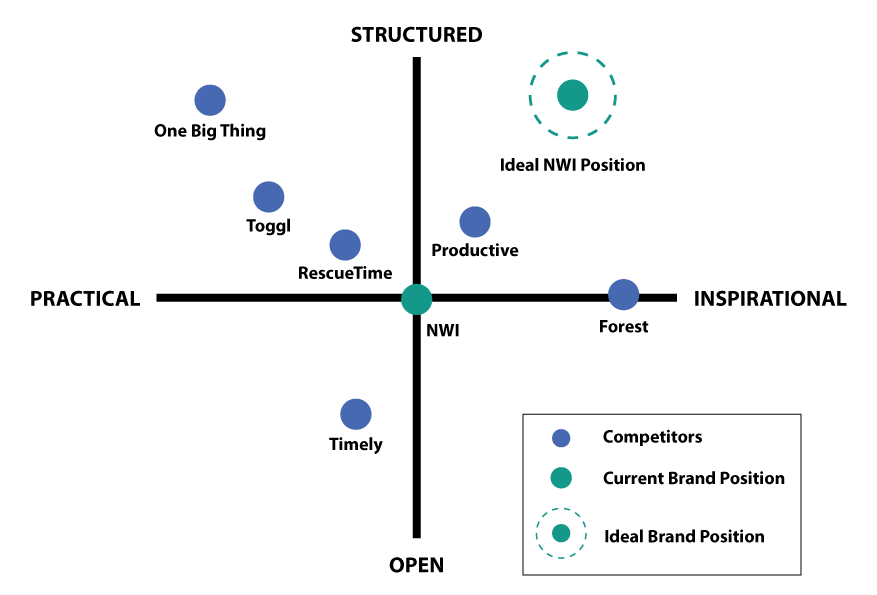
Another tool I used to better visualize this information was a Market Positioning map, shown below. Positioned along the X-axis, time management tools can be more inspirational or practical. On the Y-axis, they can be more structured or open. With this analysis, the National Wellness Institute’s new market position with their time management tool would be something that is more structured than open, since users need something that helps keep them organized and doesn’t overwhelm them with the possibilities of customization, and also something that is more inspirational than practical, since a large majority of users have a lack of motivation to get their things done.
User Personas
I was close to defining the main features to focus on for the wellness tool for time management, but I needed to take a closer look at how those features could actually benefit the users throughout a typical day in their lives. And so I defined Primary and Secondary User Personas to humanize my users, give them a face and name, pulling characteristics, habits, motivations, pain points and goals based on user data, quotes, takeaways, etc.
The Primary Persona, Regretful Rachel, represents the younger side of the 18-34 majority, the students struggling to balance school, work and personal life, to give themselves enough time to study, who are constantly distracted by social media, and who struggle immensely with procrastination. They want to manage their time more wisely to get everything done. The Secondary Persona, Overwhelmed Owen, is married, has kids, has a business, and spends more time helping others at work than working on his own tasks. He feels like he doesn’t spend enough time with his family, and has to take work home, and also feels like he has no time for his personal projects. He wants to improve his time management and prioritize tasks to bring more order to his life.

Regretful Rachel (Primary Persona) 22, Busy student, tech-savvy
and Bored Becky (Secondary Persona) 33, Millennial Dad, tech-savvy
Focusing on my primary persona, Regretful Rachel, for the purposes of this project, I created a more complete User Persona diagram (seen below). The “narrative” and “character development” of the User Personas is based on trends and key takeaways from user research, taking into account the demographics, goals, frustrations, use of technology, etc., of the users.
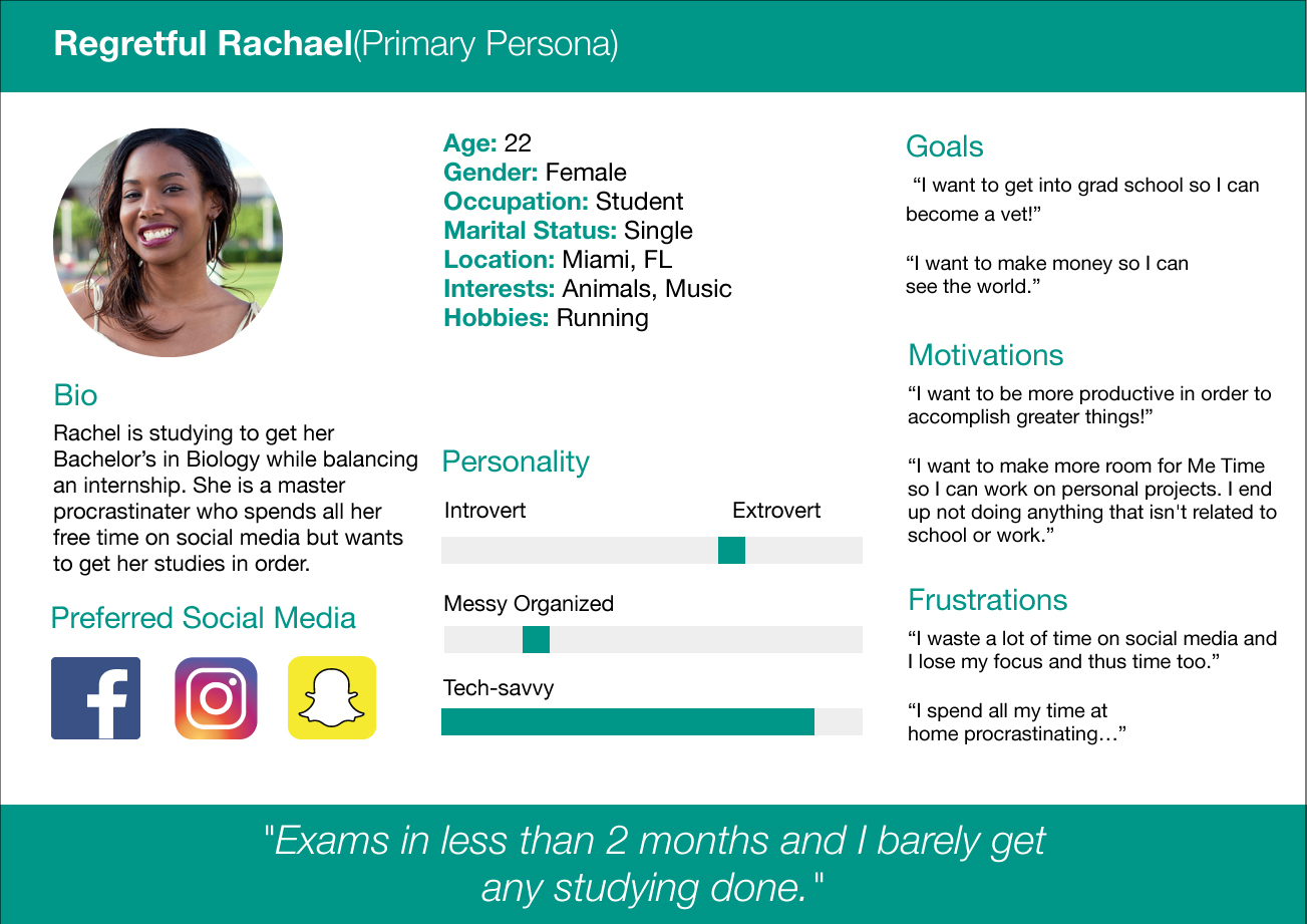
The User Persona tool was a great help and something I referred to throughout the entire process. I used it as a “reality-check” and validation method to ensure that my decisions made sense for the user. My personas represented actual, breathing people, so I could ask myself questions like “would Regretful Rachel actually want to use this? Would this be useful to her?” and “how would we motivate Regretful Rachel to stay off social media for a while and focus on her tasks?”
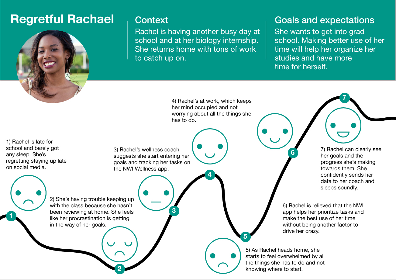
To understand my users’ goals on an even deeper I created a User Journey for Regretful Rachel (seen below). This is a tool that lays out a typical day in the persona’s life and highlights their thoughts, feelings, what they’re seeing, what they’re hearing, what they’re saying, etc., during different moments. With this I was able to identify the best moments for the new tool developed in the project to come in and help benefit their lives and help them achieve their unique goals. This is an exciting moment for me because, while staying deeply rooted in the user data, I had a bit more room to get creative and imagine different, realistic scenarios for the user.
Feature Prioritization
Equipped with all this data and having truly understood my users’ needs, it was time to define the features I would prioritize for the MVP of my project, which at this point had started to take form as a mobile application. I had some ideas for possible features to include in my wellness tool, and decided to use Card Sorting to start prioritizing some of them.
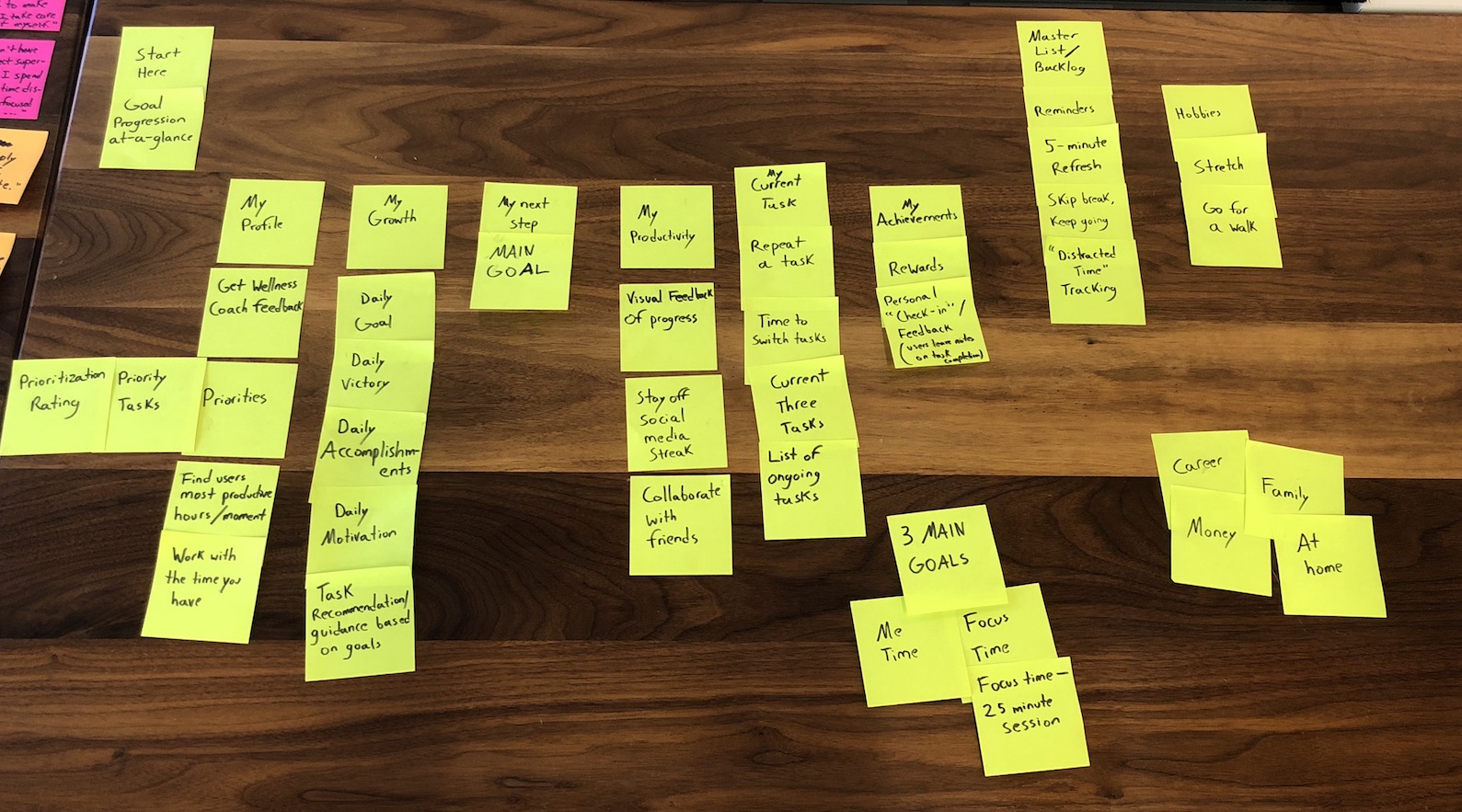
Card Sorting done by one user
The card sorting helped me get a feel for how people organize their mental maps. Some of the terminology I was pretty confident about actually stumped the users tested.
For further feature prioritization, I used the MOSCOW feature prioritization tool, wherein you list the Must Have, Should Have, Could Have, and Won’t Have features of the project you are designing for. I was still feeling a bit overwhelmed with all the possible features before, but this tool helped me find the ones to focus on and made it much more manageable; it made me realize what was most important in the wellness tool. Definitely a must-use tool for me.
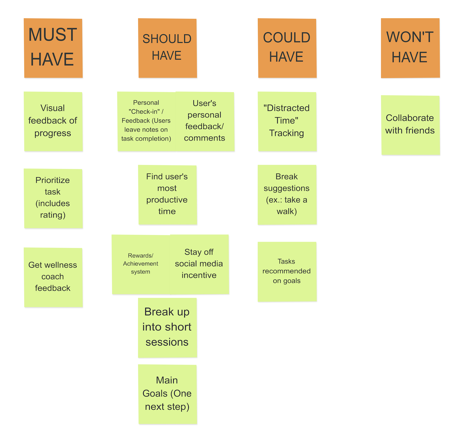
MOSCOW Feature Prioritization
Concept Sketching
Now that I knew which features to focus on, it was time to start structuring the information included in my app. I worked on a first version of the Site Map, refining the list of feature ideas, and used that to make a first version of the User Flow. I tried to keep my primary persona Regretful Rachel in mind at all points, trying to think of what would make a happy path for her.
I needed to do some more brainstorming to refine both the site map and user flow, so I completed two rounds of 6-8-5/Crazy 8s to get the ideas flowing and think of possible layouts for the app based on the main features.
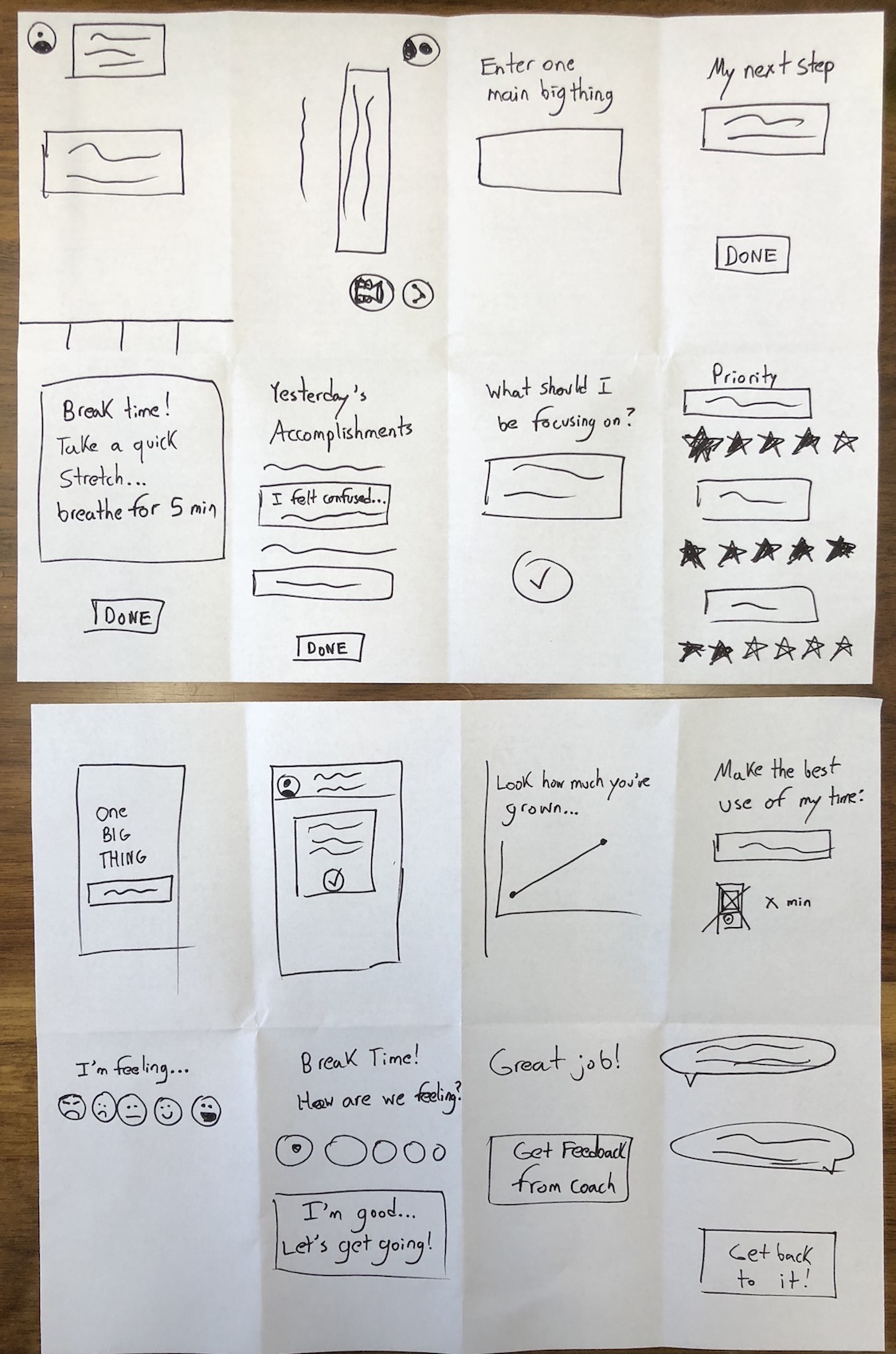
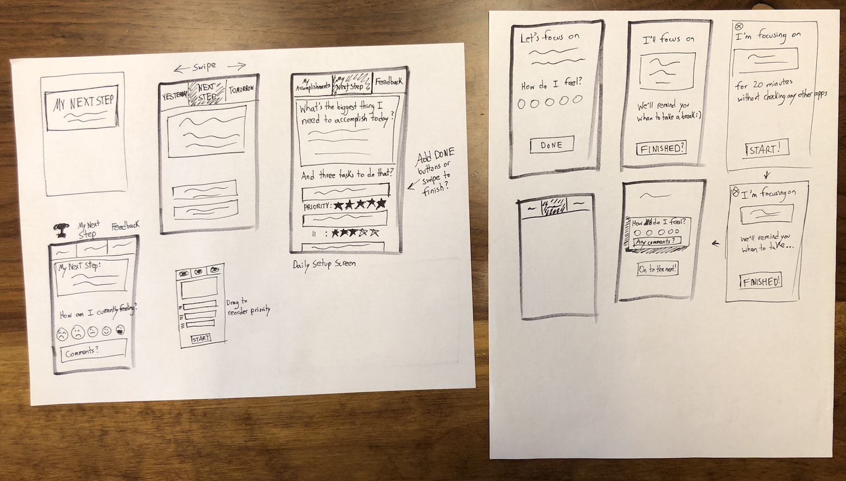
The ideas were starting to come together, and I was now able to refine both the site map and user flow.
Click here to view Set Out User Flow Version 3
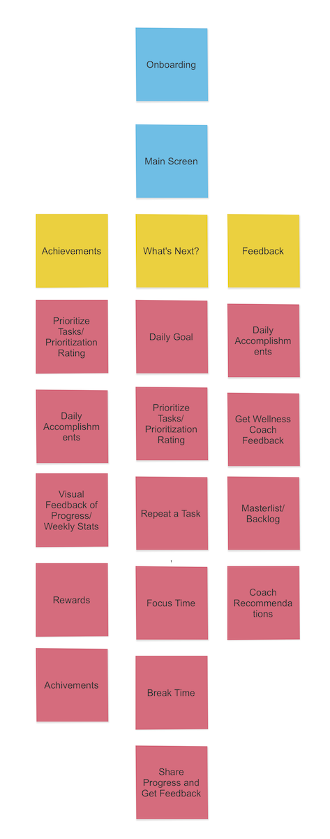
Set Out Site Map
Lo-fi Prototype
I’d defined the structure of my app, so it was time to put together the first prototype, the lo-fi paper prototype. I sketched them out in paper then added hotspots in InVision to make it interactive.
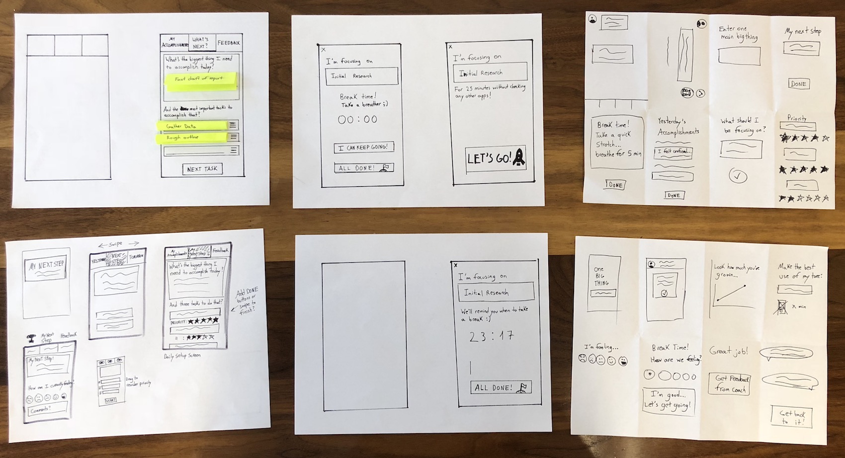
Lo-fi Prototype screen sketches
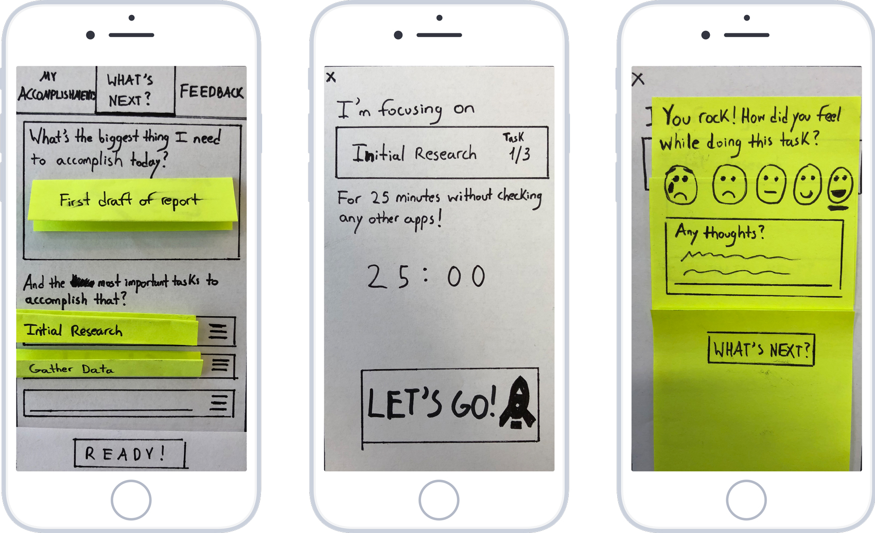
Lo-fi Prototype Home, Current Task and Feedback screens
Here are some of the main takeaways from the lo-fi testing:
- Changed “Next Task” to “Ready!” as the former was confusing to users. The “What’s Next?” button on the top nav was actually a more natural option to click for users after entering their “biggest things they need to accomplish today” and the tasks, not “Next Task”.
- Having a timer came as a surprise, out of nowhere. Should ease users into it with a better description or onboarding process.
- The screen for My Accomplishments was missing and I learned just how crucial it was to the user flow, so I included it.
- The What’s Next? on top – users kept thinking it was a button and not just the home screen. Maybe change to something like “What’s My Next Task?”
- Again, “What’s Next?” was confusing. Maybe “What’s up next?” to go back to home or straight into the next task.
- One user didn’t like how completed tasks disappeared from the home screen. Should make it clear that it is not to overwhelm them with long lists of tasks, per one of the frustrations found in user research.
- Find out how to better show draggable elements in wireframes (for Priority Tasks). Many users thought that icon for changing task order was a hamburger menu.
- “Am I giving myself a timer or choosing the time, setting it myself?” – add explanation task: “We recommend starting off with a 25-minute session.” Explain the use of the Pomodoro technique, breaking tasks down into more manageable, shorter sessions.
- “I wish I was able to set my own timer.” Maybe have recommend times based on Task Difficulty…Small Task, Medium Task, Big Task…
- Let’s Go! Button on Curren Task screen is confusing. Change it to something like Launch, etc…
- “I can keep going” confusing. Maybe change to something like “I wasn’t able to finish”, “Not Finished”, “Another 25″…
- Add icons to Accomplishments (Trophy, medal?) and Feedback with coach (Chat icon?) to make page objectives more clear.
- A few users commented that the nav bar on top felt unnatural. “I feel like it should be on the bottom.” I had placed it on top as to not confuse the user and interfere with the big buttons, like to start working, but I definitely had to revisit that.
- Text boxes – add “Insert” or something in low opacity so person knows that they are supposed to type.
- One user thought the draggable element icon to change task order was for more options.
There were a lot of changes to be made, but I was happy to see that the main user flow was easy-to-use and made sense to the users. They could easily add a goal, break it down into tasks, work on it, and then input their thoughts and feedback. Multiple users even said it was something they really wanted to have at the moment and start using.
Mid-fi Prototypes
I took all of the feedback from the previous prototype into account when making the next iteration, reproducing the improved layouts in Sketch and making a click-through version in InVision. But it is important to stress that the prototype at this stage was still in black-and-white, because I had to test the user flow itself. It does not make sense to implement a full design system if the main flow itself is not working. That part would come later on in the process.
Following previous user feedback, I made changes to some of the wording throughout the app, added icons to the nav bar to make it clearer, and added a screen for feedback between the user and their wellness coach, a requirement in project scope. A large part of the experience is allowing the user to input their thoughts and feelings on completed tasks and goals, and get guidance, motivation and advice from their coach on how to proceed.
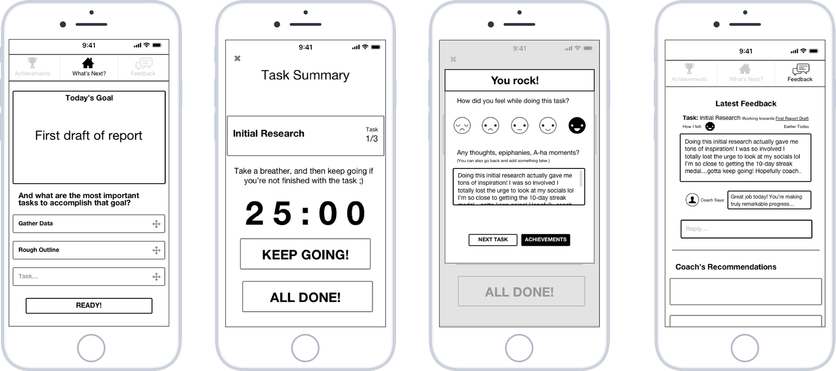
Lo-fi Prototype Home, Current Task, Feedback, and Wellness Coach screens
These are some of the main takeaways from the mid-fi testing:
- Task summary box – though it would drop down and show all tasks, option to switch. Many users wanted the option to change the current task order within this screen, in case they changed their mind.
- Users didn’t know that the feedback they were inputting would also go to their coach. They wanted the option to either keep it to themselves or send it to them.
- Some users were confused about the three-task limit. “You’ll always have to add 3 tasks?” This is another aspect to be included in the onboarding, explaining its role in helping the user to prioritize the most important tasks first.
- One user was unsure and confused about the 25-min strategy, but once I explained it to them they liked it a lot — again, explaining Pomodoro technique upfront is a must (onboarding). Include explanation of Timeboxing technique + 3-task guideline for onboarding
- “Epiphany” was a big word — maybe just “any thoughts” and “a-ha moment”. One user didn’t know what epiphany meant.
- Improvements had to be made to the achievements-feedback screen flow. Some users were confused and thought the feedback content of the user flow was would be under Achievements.
- Users wanted to able to see how long a task actually took, how many 25 sessions were needed.
- The new draggable element icon for changing task order was a lot clearer
- Users enjoyed the main feature of the app “I like that! This is your most important task and work on it for 25 min…really good.”
- Users liked having the Achievement screen — really good, sense of achievement, the positive reinforcement. “So I have 2 more tasks and then I get an achievement? Cool.”
- Feedback screen: “Feels good, feels like I’m talking to an actual person, like universal chat box (based on platform)”
- Users liked that the app was working themselves up to becoming more disciplined.
- On home page, maybe add “Tasks” title, with a subheader being the description, to better identify that section and differentiate Goal and Tasks better.
- Think about helping out w/feedback completion – quick-response suggestions, keywords…like a survey
- Maybe make You Rock! Its own page, then next task, achievements as a modal? With more detail
- Add notification (1) on feedback tab to indicate new feedback
- (2) on home page tab to indicate # of remaining tasks
- Users liked the goal + smaller tasks breakdown, makes everything more manageable
- Most recent achievements – some users didn’t know if they would see tasks or goals. Wish it would reflect progress on both, “75% complete on this goal”…
- Topbar nav – make icons just a little darker, right now they’re too light and it seems like you can’t even click them
- Add achievement content. Should be included in mid-fi prototype so hi-fi is more about just adding colors and fonts.
The feedback I received was yet another reminder to never work with assumptions; user feedback will always show you the right direction to take. It is quite humbling to experience this! I refined the screens by improving legibility and flow with alignment and layout based on guides and the 12-column rule.
Brand Attributes + Moodboard
The main user flow made sense to users and was working, so I felt I was ready to create the User Interface. I created a moodboard to help kickstart this process; I find it extremely helpful because it helps you get into the feel, mindset and the mood of the theme behind the user interface.
To begin, I put together a list of Brand Attributes by narrowing down from Product Reaction adjectives and Brand Personality adjectives, all which describe the feelings the app should elicit from the user: Friendly, Innovative, Calm, Reliable
At the same time, I completed a Visual Benchmark Analysis to understand what kind of design systems are being used in the market, getting visual inspiration and trends from the competitors in the market and from general design trends. Although there is a ton of room for creative design and innovation in a project like this one, there are various parts of an interface that are time-tested and should remain consistent across apps because their meaning is so ingrained in users’ mental models. This facilitates the on-boarding process and makes an app more accessible.
With these initial steps complete, I pulled different images together to create my moodboard; images that matched the brand attributes, UI references. This is a reduced version of it:
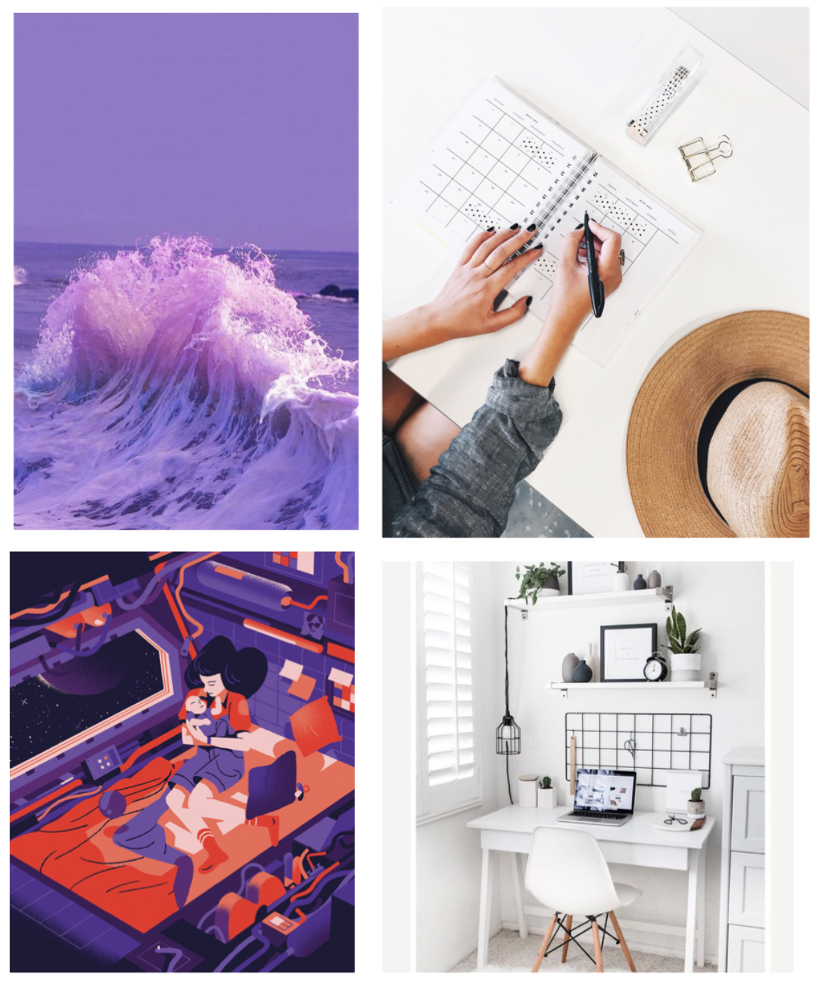
I tested the full moodboard with a couple of users and had them describe it in their own words, to see if it lined up with the brand attributes I had in mind. Users said it felt soothing and calming, particularly the use of space elements and lavender. They liked the organization aspect to it, found it mesmerizing, futuristic and forward-thinking. In addition, the colors used felt like “a call-to-action”, exciting and friendly, clean, professional, and a sense of ease.
I was satisfied with this feedback and felt like I was on the right track with my visual and “feel” references for the user interface of the app. The next step was to do some A/B Testing with different screens of the hi-fi prototype.
HI-FIDELITY PROTOTYPE VERSION 01
With the finished mid-fi prototype with the full basic flow and screen states, I focused on creating hi-fi versions of three main screens – the Home screen, Task Summary screen, and Feedback screen.
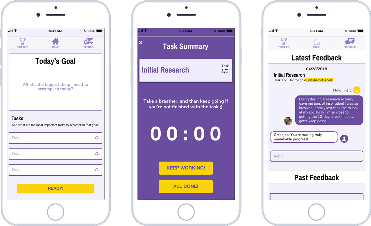
Hi-fi Prototype Version 01 Home, Task Summary and Feedback screens
From my user research I knew that users felt overwhelmed with all the things they had to get done, had too many distractions and had problems prioritizing their tasks. To that end, I tried making this first hi-fi prototype as minimalist as possible to minimize distractions and focus on the essentials. In the interest of doing some A/B testing and experimenting with different options, I presented users with two more versions of the main hi-fi screens.
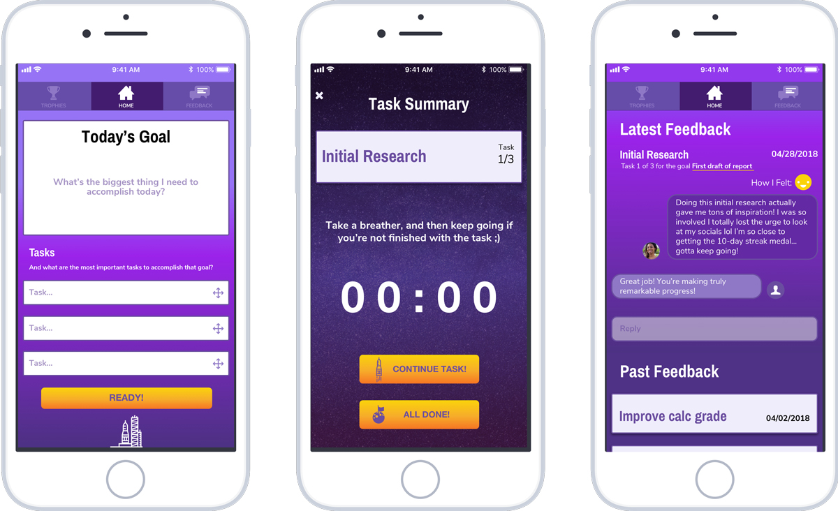
Hi-fi Prototype Version 02 Home, Task Summary and Feedback screens
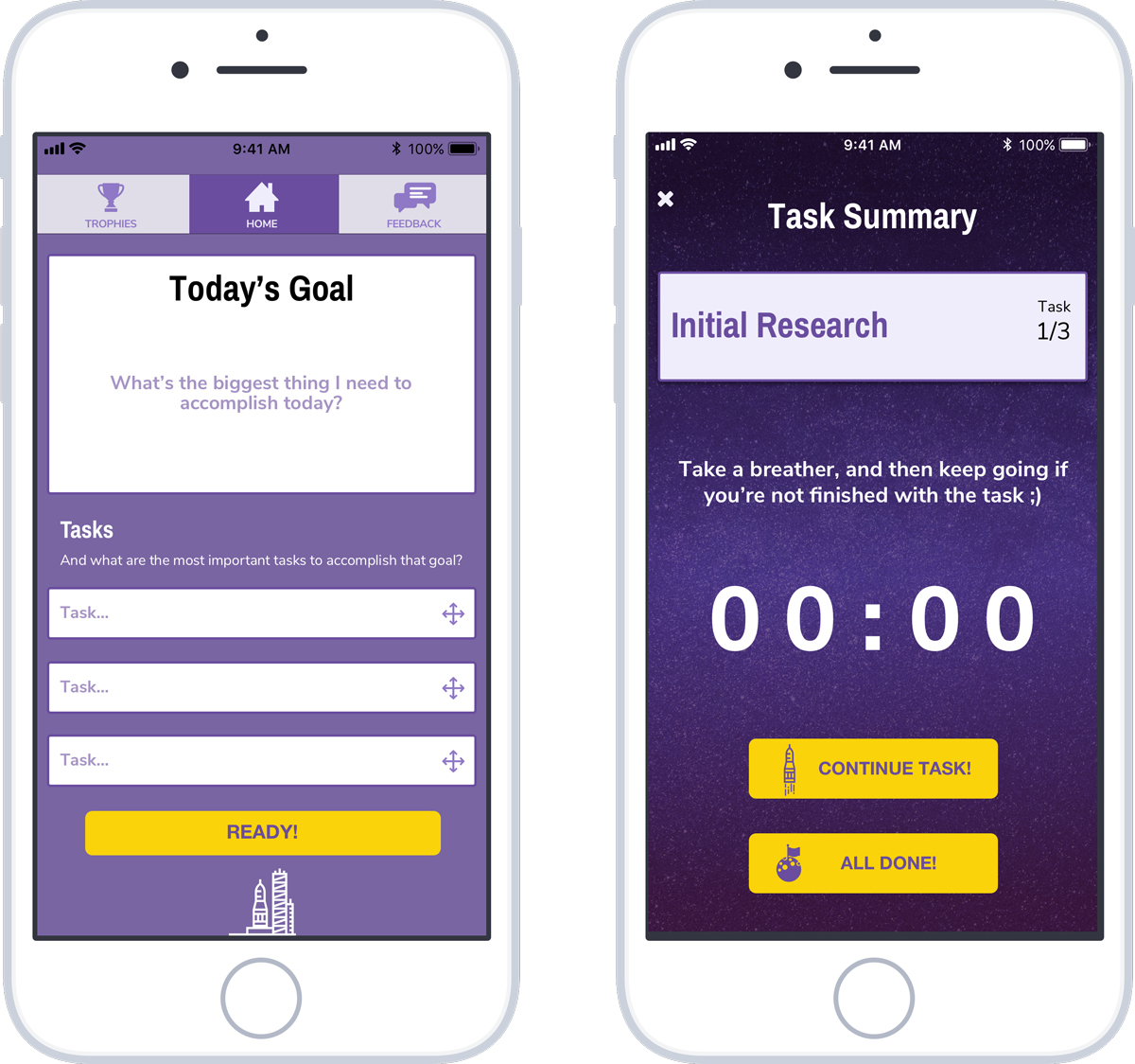
Hi-fi Prototype Version 03 Home, Task Summary and Feedback screens
It was here that I was met with quite the unexpected turn of events. I had made the mistake of assuming that the version 01 screens would be the clear winner among users, based on my research, but I quickly learned that assumptions should not be made – all must be decided through user testing. Users described version 01 as “too corporate”, “dull and boring” and “too business-like”. Some also said “not very calm”, “inconsistent”, “hard to read” and “not too exciting”.
For Version 02 I wanted to get a feel for how a more “gradient-heavy” design would work with users, and the feedback I received was that it was “too distracting”, “overwhelmed”, “too much”, and that they “don’t know where to look” and that the interface “gets in the way”. But another thing I wanted to test was the use of space-themed elements (like icons and backgrounds) throughout the interface. This resonated with users and they enjoyed the brand personality that they added to the app.
As for Version 03, I wanted to create somewhat of a hybrid between the two, and users reacted positively; they felt it was more consistent, trendy, cool, more organized, entertaining and attractive. They also felt that navigation was a lot clearer (“It’s easier to tell what tab I’m on.”), with better framing with the background. And again, the the use of space-themed elements was well-received.
This round of testing was a game-changer for the project and an important lesson for me. Instead of assuming what would work best for the users, it made a lot more sense to simply go out and test with them to find out. Version 03 was definitely more in line with the brand attributes, and now I had a better idea of what direction to take.
Style Guide
I had the direction I needed to start fleshing out the style guide for the user interface and choose typefaces, refine button sizes and styles, and choose a name for the app and create a logo.
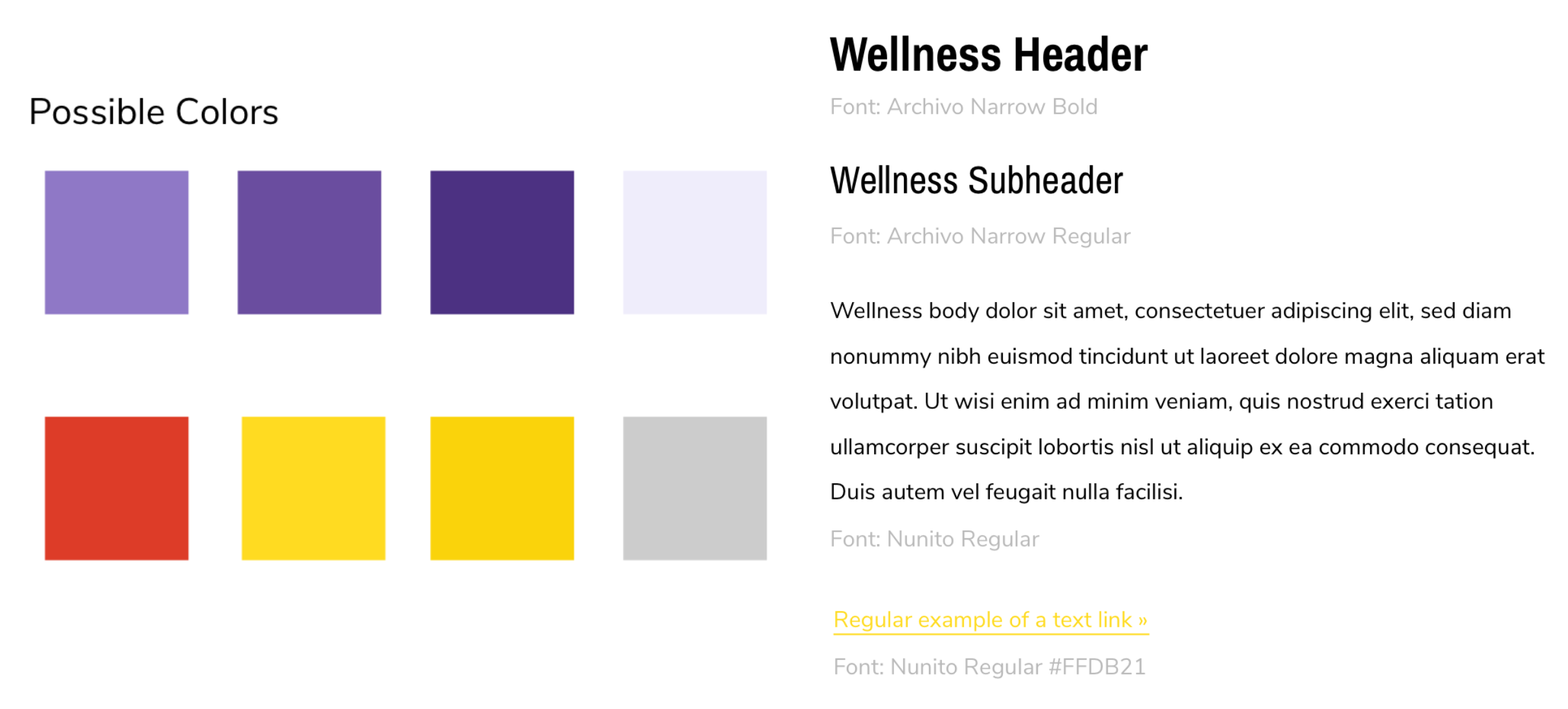
The icons used in the logo and throughout the interface are modified versions of icons created by Eucalyp at The Noun Project. The name “Set Out” is meant to reflect the users’ goals with the app: to get out there and set out to accomplish what they need to do. The space theme reflects the users’ journey of going after their goals, and accomplishing tasks is like exploring the unknown reaches of space and making new discoveries.
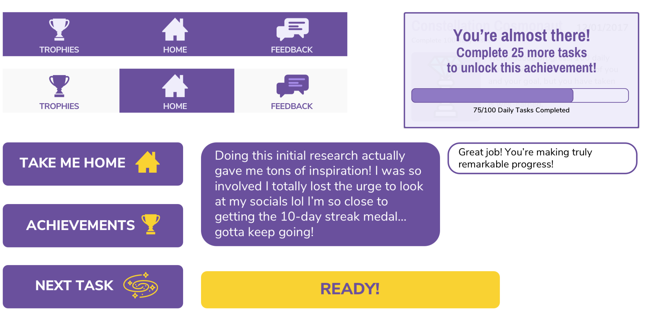
Some of the boxes, buttons, icons and glyphs used to build the screens and nav bars.
Hi-Fidelity Prototype Version 04
Further testing allowed me to refine my hi-fi prototype further and improve legibility to give the entire layout more breathing room and not overwhelm the user with too much content at one time, make the design and navigation more consistent throughout screens and incorporate the style guide. I also finished adding hotspots to all the buttons and parts of the navigation.
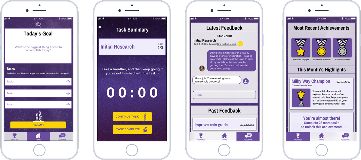
Hi-fi Prototype Version 04 Home, Now Playing and Share screens


